Evolving Information Architecture for New Product Vision
information architecture
card sorting
tree testing
Problem
My Home dashboard on Realtor.com helps homeowners monitor and care for their most valuable asset. Recently, many new features were added to the dashboard to address broader homeowner needs.
However, the one-page layout became overwhelming with this expanded vision, as gathered via customer feedback. In addition, more features that meet holistic homeowner needs are coming, but they may go undiscovered if the layout stays confusing. The goal is to evolve the information architecture and layout to match this expanding vision. This will make the key features easier to find and hopefully, increase homeowners' engagement with the dashboard to help them care for their home.
However, the one-page layout became overwhelming with this expanded vision, as gathered via customer feedback. In addition, more features that meet holistic homeowner needs are coming, but they may go undiscovered if the layout stays confusing. The goal is to evolve the information architecture and layout to match this expanding vision. This will make the key features easier to find and hopefully, increase homeowners' engagement with the dashboard to help them care for their home.
Research Questions
︎
Understand how homeowners group and categorize home-related tasks and features
︎
Identify an optimal information architecture and navigation model
Research Questions
︎
Understand how homeowners group and categorize home-related tasks and features
Understand how homeowners group and categorize home-related tasks and features
︎
Identify an optimal information architecture and navigation model
Identify an optimal information architecture and navigation model
Process
![]()
Process
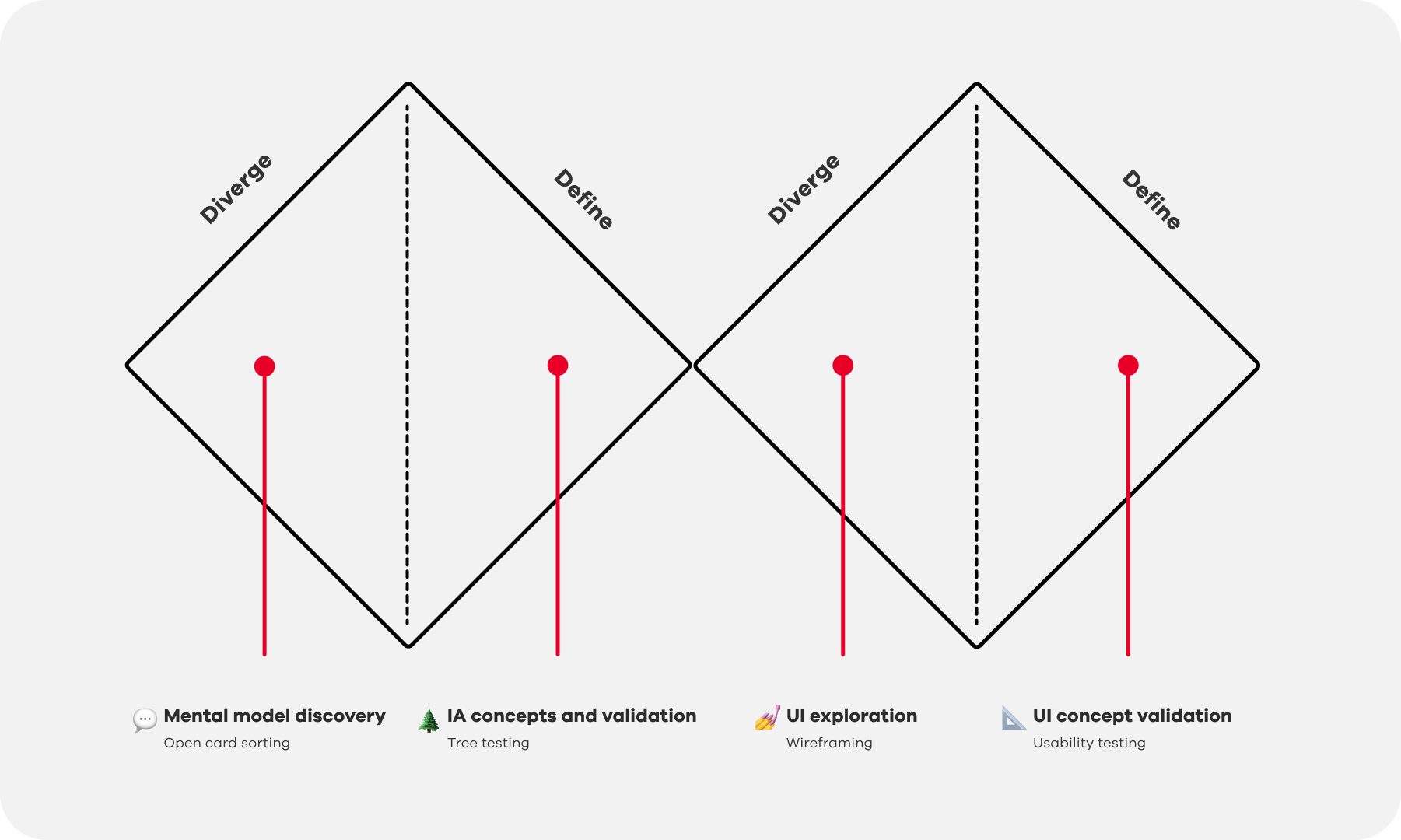
Methodology
Open card sorting with 150+ homeowners across different groups to understand mental model and categorization
Tree testing with 3+ concepts among 90+ homeowners assess findability of key information
3+ rounds of usability testing to create and refine navigational models and labeling approaches
Key Findings
︎
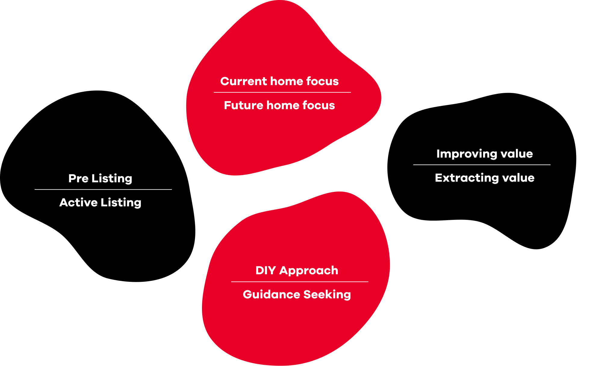
Uncover new mental models:The open card sorting study revealed homeowners think about home-related tasks and needs in creative ways beyond typical transactional categories like buy, sell, rent. This helped the team expand beyond limitations in existing mindsets and showed the need to avoid restricting thinking to a predetermined structure.
![]()
Key Findings
︎
Uncover new mental models:The open card sorting study revealed homeowners think about home-related tasks and needs in creative ways beyond typical transactional categories like buy, sell, rent. This helped the team expand beyond limitations in existing mindsets and showed the need to avoid restricting thinking to a predetermined structure.
Uncover new mental models:The open card sorting study revealed homeowners think about home-related tasks and needs in creative ways beyond typical transactional categories like buy, sell, rent. This helped the team expand beyond limitations in existing mindsets and showed the need to avoid restricting thinking to a predetermined structure.
︎
Clustering of similar information:
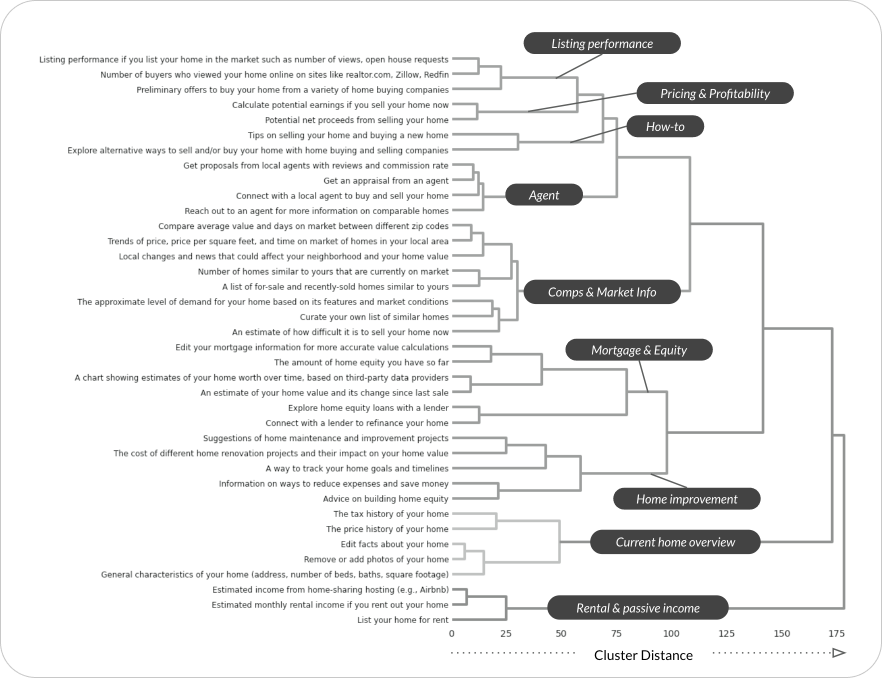
A dendrogram visualization was created to reveal clusters of related information. This graph illustrated potential groupings of information at different levels, from highly detailed clusters to more broad, high-level groupings. The dendrogram enabled us to visually analyze how the information could be organized in various ways.
![]()
︎
Clustering of similar information:
A dendrogram visualization was created to reveal clusters of related information. This graph illustrated potential groupings of information at different levels, from highly detailed clusters to more broad, high-level groupings. The dendrogram enabled us to visually analyze how the information could be organized in various ways.

︎
Identify optimal level of grouping:
The tree testing revealed that moderate grouping and clear labeling help users find information with less effort. Extreme grouping requires more work from users, while minimal grouping causes confusion. Broad labels that associate with many topics led users to click around more. Flattening hierarchy exposed content directly and reduced errors. Cross-linking related but separated topics proved useful for certain user goals.
![]()
︎
Identify optimal level of grouping:
The tree testing revealed that moderate grouping and clear labeling help users find information with less effort. Extreme grouping requires more work from users, while minimal grouping causes confusion. Broad labels that associate with many topics led users to click around more. Flattening hierarchy exposed content directly and reduced errors. Cross-linking related but separated topics proved useful for certain user goals.

︎
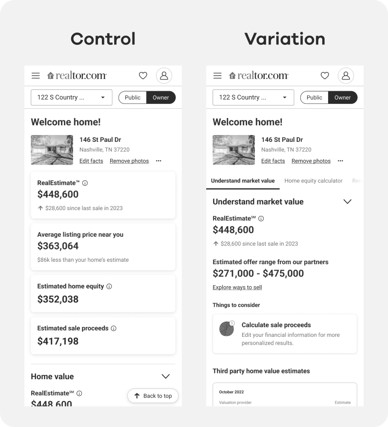
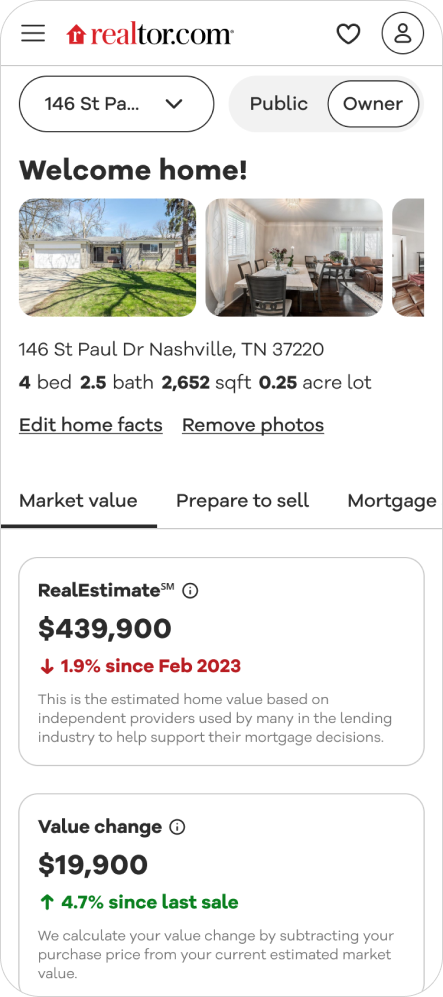
Translate to navigational model:
Usability tests showed navigational modesl such as tabs help homeowners navigate and find features easier without getting overwhelmed. Testing also showed condensed layouts with highlights and summaries can help homeowners understand their situation faster.
![]()
︎
Translate to navigational model:
Usability tests showed navigational modesl such as tabs help homeowners navigate and find features easier without getting overwhelmed. Testing also showed condensed layouts with highlights and summaries can help homeowners understand their situation faster.
Translate to navigational model:
Usability tests showed navigational modesl such as tabs help homeowners navigate and find features easier without getting overwhelmed. Testing also showed condensed layouts with highlights and summaries can help homeowners understand their situation faster.
Impacts
A more intuitive and sustainable IA structure:
The new information architecture was launched in an experiment to assess its impact. The updated IA generated more engagement with modules that had less interaction before. Key conversation metrics also improved, including contact rates for services offered through the dashboard.
![]()
Impacts
A more intuitive and sustainable IA structure:
The new information architecture was launched in an experiment to assess its impact. The updated IA generated more engagement with modules that had less interaction before. Key conversation metrics also improved, including contact rates for services offered through the dashboard.
The new information architecture was launched in an experiment to assess its impact. The updated IA generated more engagement with modules that had less interaction before. Key conversation metrics also improved, including contact rates for services offered through the dashboard.
Team
-
Elizabeth Ropp - Product Designer
- Catherine Hermansen - Content Designer
- Nam Pham - Researcher
- Jeremy Han - Product Manager
Team
- Elizabeth Ropp - Product Designer
- Catherine Hermansen - Content Designer
- Nam Pham - Researcher
- Jeremy Han - Product Manager